Contents
Guidelines for error handling and localization of error messages
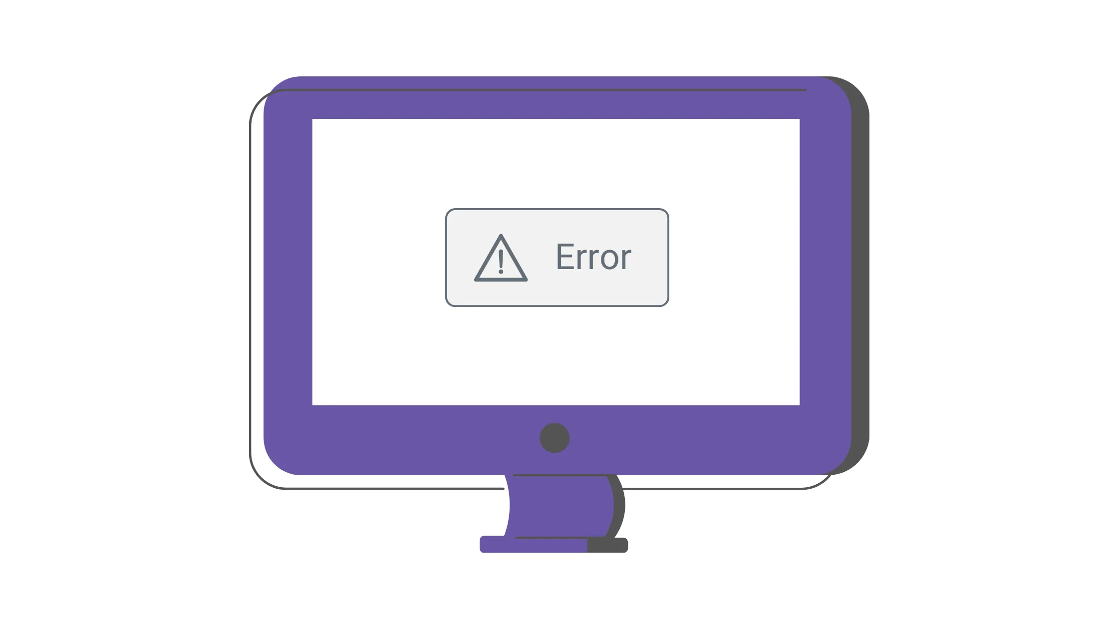
Effective error handling and localization of error messages are crucial in UI design, as they significantly impact the user experience. Catering to users with diverse languages and cultures requires a seamless and engaging experience. In this article, we'll discuss practical guidelines for error messages and best practices for error handling and localizing error messages in apps. We'll explore easy-to-understand and implement strategies for enhancing your application's user experience.
Prevent errors from happening
The initial step towards improving user experience is preventing user errors through intelligent UI design. By developing interfaces that make it difficult for users to make mistakes, you can considerably reduce error rates and enhance your application's overall usability.
Nielsen's First Law of Computer Documentation underlines that users seldom read documentation unless it's essential for their task. This emphasizes the need to design intuitive UI components that minimize reliance on documentation and reduce the likelihood of users making errors in the first place.
Deliver clear and concise messages
For effective communication in UI design, it is crucial to maintain clear and concise messages. Users are less likely to read and comprehend longer messages. Although writing short messages isn't always possible, aiming for conciseness whenever possible ensures users can quickly grasp the information presented.
Avoid technical terminology
Steering clear of technical jargon in error messages is critical for a positive user experience. Historically, error dialogs in operating systems like Windows contained complex codes and terminology, making it challenging for users to understand the issue. Such messages only increased users' frustration rather than assisting in resolving the problem.
Error messages should be tailored for human understanding, primarily aimed at helping users fix the problem. By employing clear, straightforward language that is easily understood by various users, error messages can effectively guide users through the process of resolving issues without causing further confusion or frustration. Remember, the purpose of error messages is to help users overcome obstacles, not to exacerbate the pain of error handling.
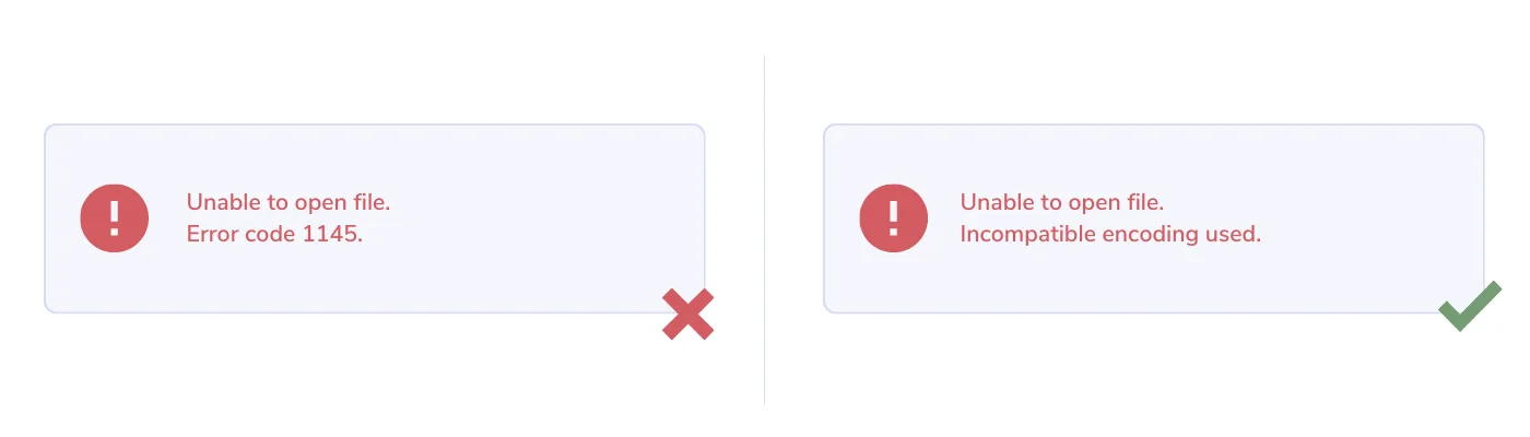
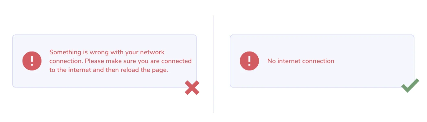
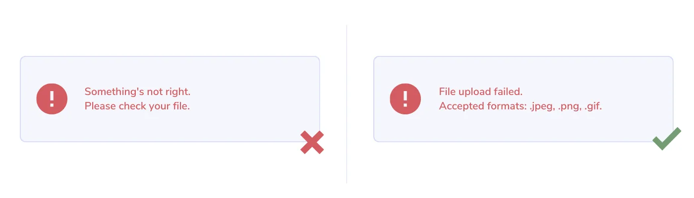
Eliminate ambiguity
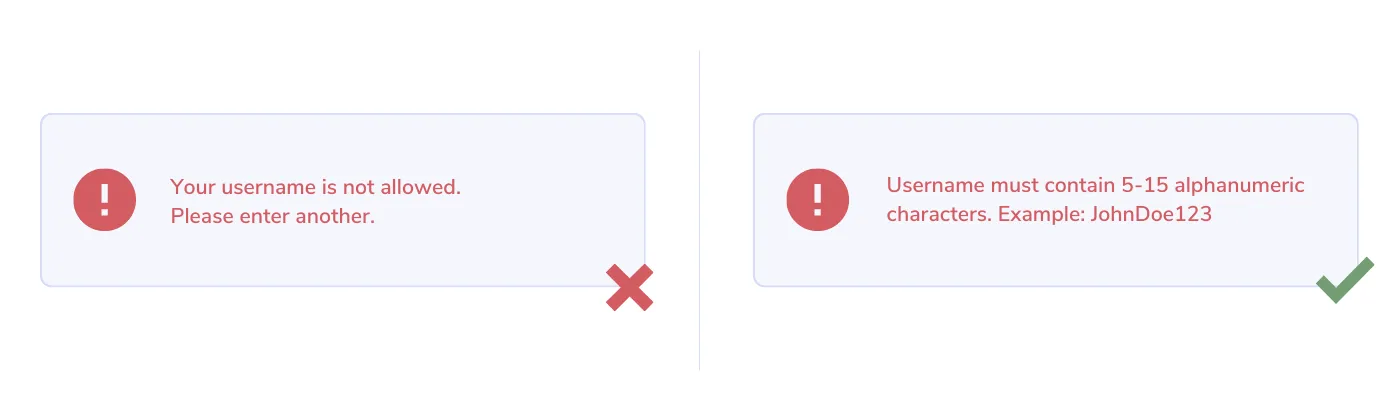
Removing ambiguity from error messages is essential for a positive user experience. Most users have experienced the frustration of vague error messages offering no helpful information for issue resolution. To prevent users from feeling exasperated, it's crucial to be specific about the error and provide clear guidance on addressing it.
Adapting messages for different user roles is important, as we cannot assume that everyone has the same level of familiarity with our applications as the developers who created them. By tailoring messages to the user's context, we can better support their needs and help them navigate any issues they encounter.
In some cases, generic error messages like "Something went wrong, please try again later" are acceptable, but this should only be done when the error's cause cannot be determined. Ideally, error messages should provide users with actionable information to help them resolve the problem as efficiently as possible.
Minimize jokes and humor
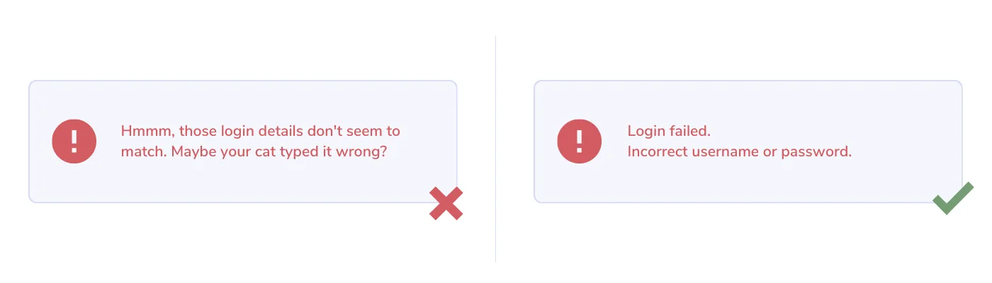
When it comes to error messages, it's important to minimize jokes and humor. While friendly, light humor can effectively enhance user experience in other areas of a user interface, error messages might not be the most appropriate place for it. Users encountering errors are often frustrated, and humor may not be well-received in such situations.
Using humor in some cases is fine, but it's essential to be mindful of the context and the user's state of mind. Focus on providing clear, helpful information in error messages to assist users in resolving issues, and save the humor for other aspects of the user experience where it can be more effectively utilized and appreciated.
Avoid blaming the user
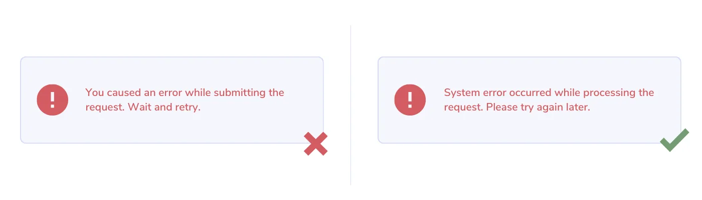
When users encounter errors in an app, it's essential not to place the blame on them. They are already frustrated, and pointing fingers can worsen the situation. Instead of using phrases like "You did" or "You didn't" when explaining what went wrong, offer clear guidance on resolving the issue.
For example, a more helpful message than "Your password is not strong enough" could be "Password must include at least 8 characters, 1 numeric, and 1 special character from the list...". This approach provides users with actionable steps to address the problem.
It's essential to use a friendly tone and positive language in error messages, avoiding negative words. This creates a supportive environment for users as they navigate through any issues they encounter in your app, ultimately leading to a better user experience.
Select appropriate styles
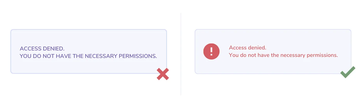
Choosing appropriate colors and font styles for error messages is essential for creating an effective user experience. Avoid using ALL CAPS in error messages, as it may come across as shouting at the user, which can be off-putting.
When choosing colors for error messages, red is commonly used to signal errors, while green typically indicates successful operations. However, color alone may not be enough to convey the message, especially for users with visual impairments or color blindness. Including icons, such as an exclamation mark for errors, can provide additional visual cues that help users quickly identify and understand the message since they tend to scan more than read.
Offer hints for resolving errors when possible
Providing hints and guidance for resolving errors when possible is a crucial aspect of designing user-friendly error messages. By offering helpful suggestions and clear instructions, you can empower users to resolve issues quickly and efficiently, ultimately improving their experience with your application.
When crafting error messages, consider including actionable steps that users can follow to address the problem. This not only reduces frustration but also minimizes the need for users to seek external assistance, saving them time and effort.
Choose the right UI components
Selecting the right UI component for showing error messages is key to enhancing the user experience. You have options like modal dialogs, toast notifications, banners, and inline feedback. The best choice depends on the context needed for the error message.
Use inline feedback for errors that are closely related to a specific context, and modal dialogs for app-wide issues. When handling form validation, inline error messages work better than long lists of errors in modal dialogs, as they help users stay focused on the context. Also, make sure not to block user inputs with error popups, allowing them to see what's wrong.
Toast notifications can display error messages, but remember that users might not have enough time to read or understand the message before it goes away. It's essential to find the right balance in presenting errors – not too overwhelming or too subtle. For significant, blocking errors, making them stand out is fine.
Try to preserve as much of the user's work as possible and let them fix errors by editing their original input, instead of starting over. By picking the right UI component for showing error messages, you can improve the user experience and make resolving errors more straightforward and user-friendly.
Properly localize error messages
Properly localizing error messages is essential to ensure a seamless user experience across different cultures and languages. When working on localization, it's important to:
- Adapt error messages to different cultures and languages, being careful not to use words or tones that may be offensive in some contexts.
- Consider the variation in length for different languages, as translations can vary considerably and may break the UI. For example, English is more compact compared to languages like German or Finnish.
- Account for different plural rules across languages, and if using ICU Plural in error messages, be prepared to add additional plural forms in localization messages.
- Format numbers, dates, and times in error messages appropriately depending on the language.
- Extract and reuse "common" error messages to reduce translation costs and simplify maintenance. For example, use fewer string keys in localization files (e.g., "commonErrorInvalidEmail" instead of "pageLoginErrorInvalidEmail", "pageRegisterErrorInvalidEmail", etc.) if the error message is the same.
- Prioritize accessibility and consider screen readers by translating hidden text as well. Some websites, for instance, prefix error messages with a hidden "Error" span for screen readers.
Invest in preventing errors from recurring
Continuously improving the UI/UX of a product involves identifying and preventing errors from recurring. To achieve this, it's crucial to track errors and gather insights for future improvements. Utilizing analytics tools to collect data on errors that occur within the application can help identify patterns and uncover areas where users face difficulties or confusion.
Conducting usability tests with real users is another valuable strategy, as it allows you to gather qualitative feedback on the user experience. This feedback can be used to identify specific pain points and areas for improvement. By analyzing the gathered data and feedback, you can prioritize and implement changes, addressing the most critical issues first.
Iterating on your design and making incremental improvements based on the insights gained from analytics and usability tests is essential for creating a better product and a more satisfying user experience.
Conclusion
Mastering UI error handling and localization is essential for creating a seamless user experience. Ensuring that error messages are clear, concise, and informative, while avoiding technical jargon and blame, contributes to a positive user experience. Additionally, choosing the appropriate UI components for error presentation, providing hints for solving errors, and tracking errors for continuous improvement are all vital strategies for optimizing the user experience.
Localizing error messages and adapting them to various cultures and languages is critical, as it helps prevent misunderstandings and UI breakages due to language differences. Using the right tools, like Localizely, can greatly assist in this process by providing support for proper plural rules, glossaries, translation memory, and collaboration with translators, ensuring that your app's error messages are accurately and effectively localized.
By implementing the best practices discussed in this post, you can significantly enhance the overall user experience, making your application more enjoyable and user-friendly across different languages and cultures.
Like this article? Share it!
Aleksa is a Software Engineer at Localizely. Over the past few years, Aleksa has been working in the field of software localization. In his free time, he enjoys playing guitar and writing tech posts.
Enjoying the read?
Subscribe to the Localizely blog newsletter for quality product content in your inbox.

Resources
- What is Localizely?
- Getting started
- Localization workflow
- Translation editor
- Flutter Over-the-Air updates
- Flutter In-Context Editing
- Project branching
- Public projects
- Professional translation services
- Machine Translation
- AI Translation
- Translation Memory
- Glossary
- Tasks
- Reports and statistics
- Figma integration
- AWS S3 integration
- GitHub integration
- GitLab integration
- Bitbucket integration
- CLI
- Configuration file
- Supported file formats
- Language & Country Codes
- Referral Program
- Affiliate Program
- I18N Questions
- FAQ
Free tools
- ICU message for translators
- ICU message editor
- Hreflang generator
- Hreflang checker
- JSON Flattener
- JSON Validator
- YAML Validator
- XML Validator
- CSV Validator
- Text Compare
- Text Encoding Converter
- Localization File Converter
- JSON Word Counter
- ARB Word Counter
- Translation Cost Calculator