Contents
Designing an effective language selector
In today's globalized and interconnected digital landscape, catering to a diverse audience with varying language preferences has become increasingly important. This is where a language selector, also known as a language switcher, plays a crucial role in enhancing user experience.
What is a language selector?
A language selector is a user interface (UI) component that allows users to choose their preferred language when interacting with a website or app. The primary function of a language selector is to facilitate seamless language switching, ensuring that users can access content in the language they are most comfortable with. This, in turn, improves the user experience (UX) and promotes engagement with the digital product.
Do we need language selectors in apps?
Language selectors significantly improve user experience (UX) by empowering users to customize their interactions with the app. When users can effortlessly switch to their preferred language, they are more likely to engage with the app, understand its content, and navigate it with ease. This ultimately leads to higher satisfaction rates and increased user retention.
Why using IP addresses or browser language settings may not always work?
Relying on IP addresses or browser language settings to choose a user's language might not always be accurate. IP-based location detection can have issues because of VPNs, proxies, or when a user is traveling abroad. Browser language settings might not represent the user's current preference or may have been set up by default.
This is why it's important to have a dedicated language selector along with IP-based or browser language settings. A language selector lets users manually pick their desired language, giving them control over their experience and making the app or website more accessible to a diverse audience.
The controversial use of country flags in language selectors
The use of country flags in language selectors has been a topic of debate among designers and developers for quite some time. While flags can add a visually appealing and easily recognizable element to language selectors, they are not without controversy.
The debate surrounding the use of country flags in language selectors stems from several concerns. First and foremost, flags represent nations, not languages. Using flags to symbolize languages can lead to confusion or misrepresentation, as many countries are home to multiple languages, and some languages are spoken across several nations. For example, using the Swiss flag to represent German may alienate Austrian or German users, while using the Spanish flag for the Spanish language could overlook users from Latin American countries.
Additionally, the use of flags can inadvertently evoke political or cultural sensitivities. By associating languages with specific countries, flags can perpetuate stereotypes or unintentionally exclude certain groups of speakers. In some cases, users may feel that the use of a particular flag shows bias or favoritism towards a specific country or political entity.
Despite these concerns, there are benefits to using flags in language selectors. Flags are visually engaging and can quickly communicate the concept of language selection to users. They can also help users identify their preferred language more rapidly than text alone, especially when users are not fluent in the default language of the app or website.
To address the concerns associated with using flags, designers can consider alternative design approaches for language selectors:
-
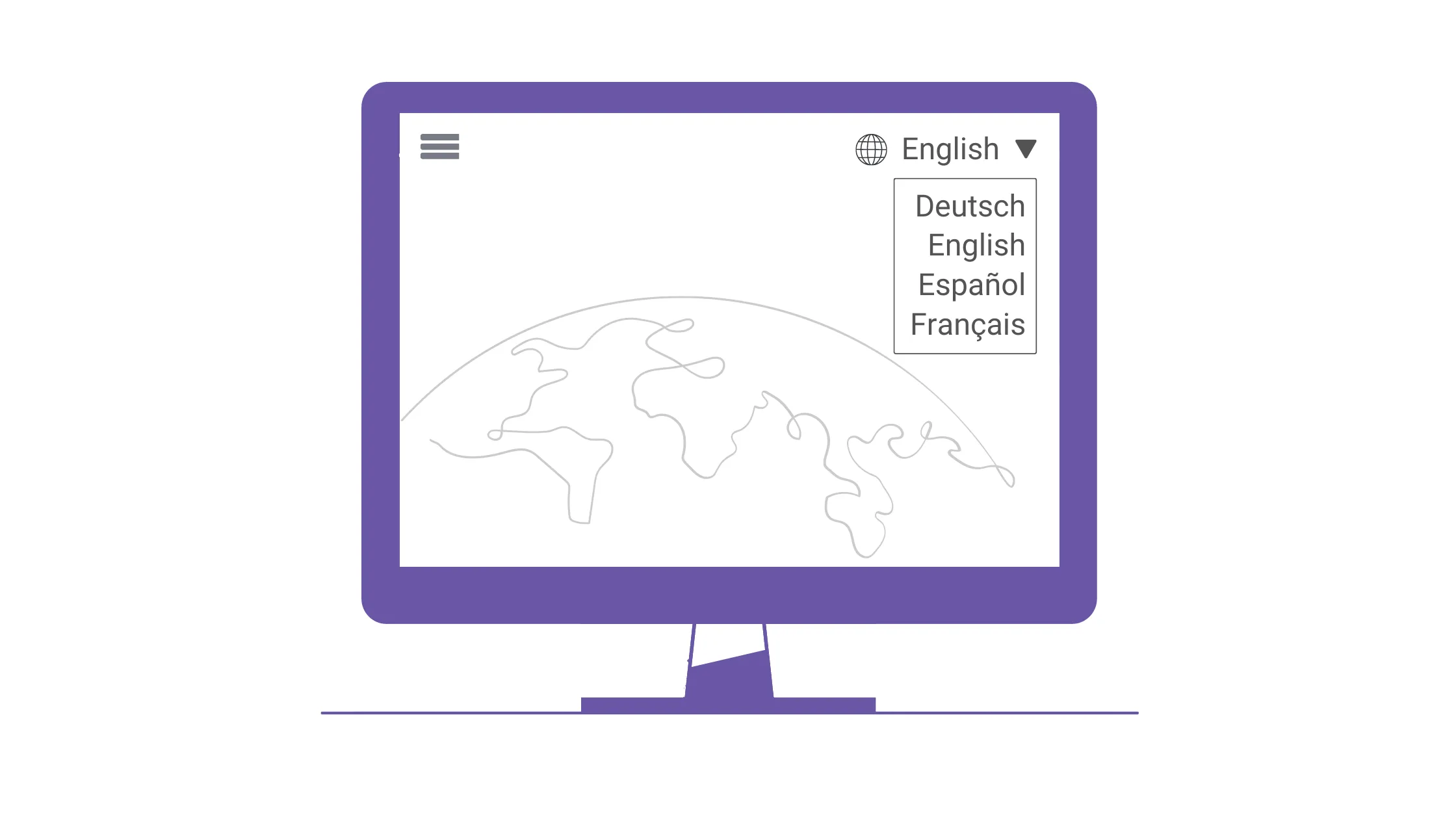
Text-based selectors: Instead of using flags, use the name of the language in its native form (e.g., English, Español, Français). This approach is more inclusive and avoids the potential pitfalls associated with flags.
-
Language icons or abbreviations: Use language icons or ISO language codes (e.g., EN, ES, FR) to represent languages without associating them with a specific country.
-
Hybrid approach: Combine text and icons or abbreviations in the language selector to strike a balance between visual appeal and inclusivity.
Language selector design
Language selector design should align with the rest of the app and be easily discoverable and usable. Common implementation methods include:
-
Selection menus: Ideal for numerous languages, drop-down menus are simple to design and implement. They are typically found at the top right or bottom of a page.
-
Modal dialogs: Similar to menus, these provide more configuration options like search, country grouping, and currency changes due to their larger size and prominence.
-
Dedicated language buttons: Suitable for specific markets with a limited number of languages, buttons can be added to the navigation menu for quick language changes. However, space constraints and button placement require careful consideration.
-
Text links: A middle ground between buttons and menus, text links in the footer cater to multiple languages without overwhelming the user interface.
Language selector examples
In this section, we'll examine language selector examples from popular websites, analyze their implementation on desktop and mobile versions, and discuss the strengths and weaknesses of their approaches.
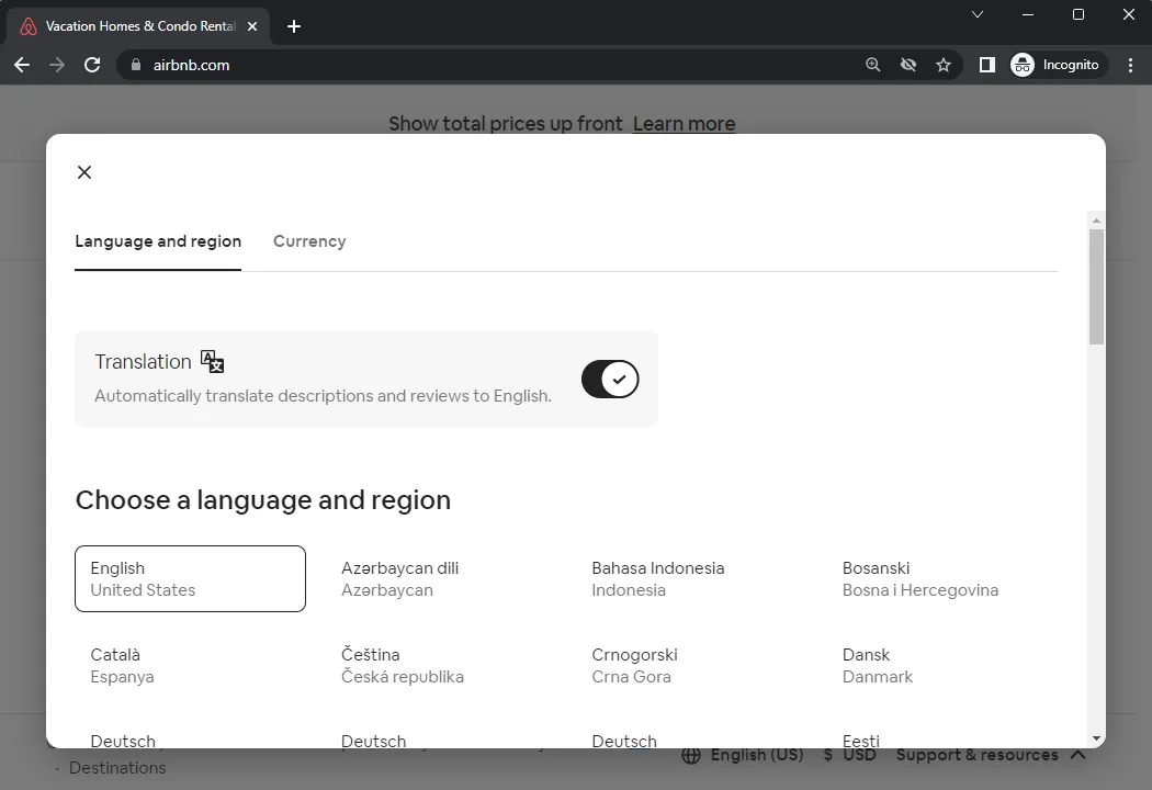
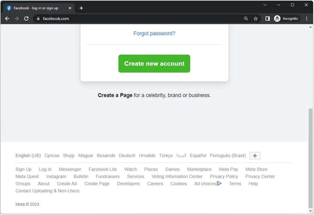
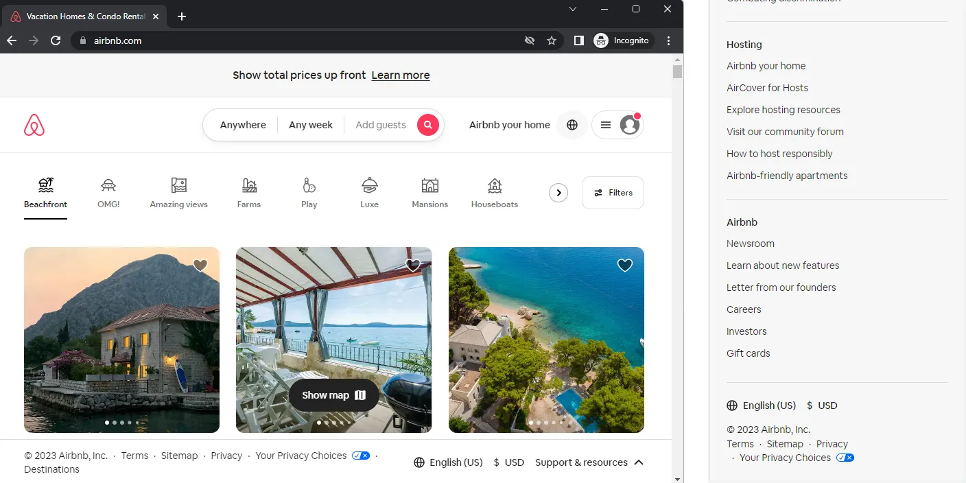
Airbnb
The Airbnb website on desktop features two language selectors. The first one is in the top menu, marked with a 'globe' icon, and opens a modal dialog for setting language and currency preferences. The second selector is in the sticky footer, alongside a currency selector. On mobile, there's one language selector in the footer, with a currency selector as well. Both desktop and mobile versions of the Airbnb website make it easy to find the language selector, thanks to the 'globe' icon and native language names for easy recognition.
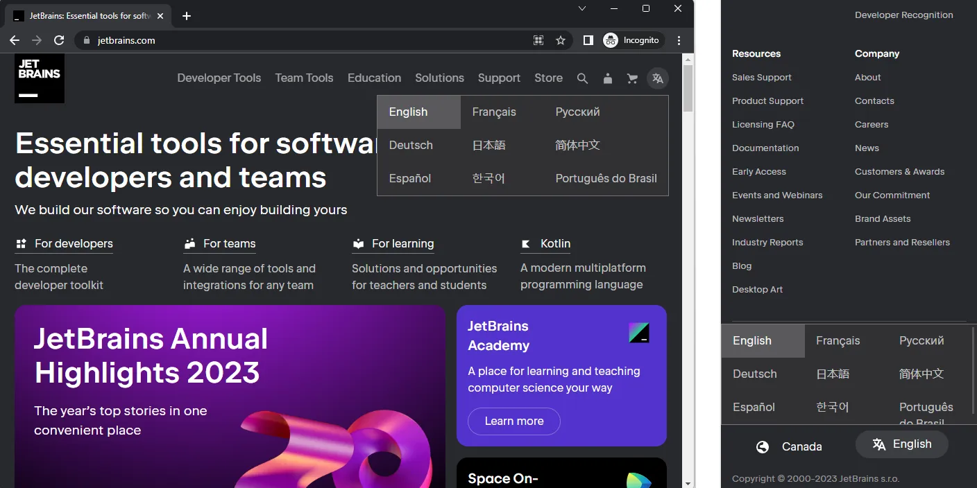
JetBrains
The JetBrains website on desktop has two language selectors: one in the top right corner and another in the footer. On mobile, there's a single language selector in the footer. Both selectors use the familiar 'translation' icon, and languages are listed in their native names for easy recognition. The placement of language selectors in expected locations makes them easily discoverable on both desktop and mobile versions of the site.
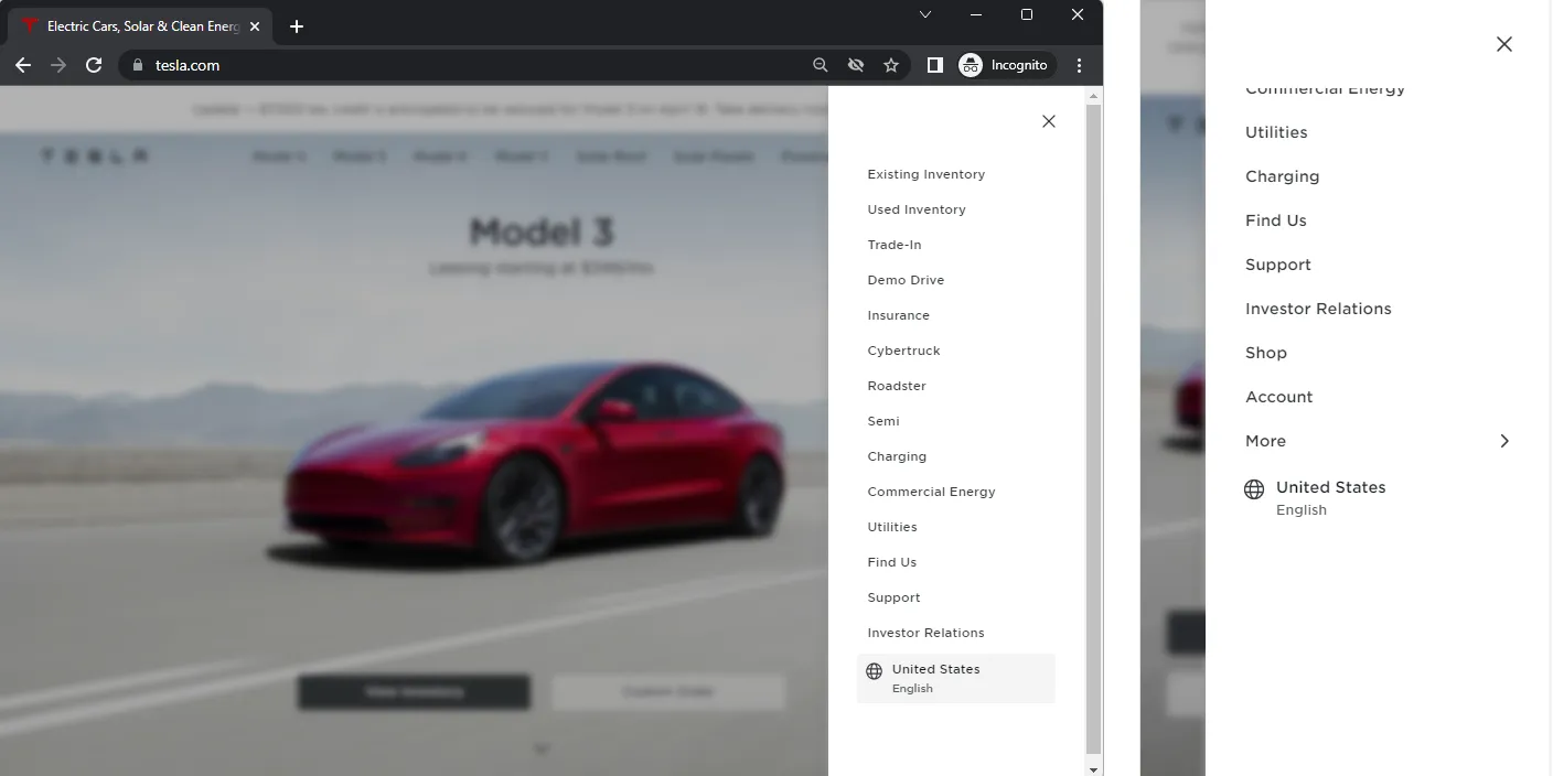
Tesla
The Tesla website, both on desktop and mobile, has one language selector located in the top right menu, marked with a 'globe' icon for easy recognition. Languages are grouped by region (North America, Europe, Middle-East, and Asia/Pacific) and displayed in their native names for easy identification. One drawback is that the language selector can be harder to find when opening a page in an unfamiliar language, as it requires an extra click on the menu. However, since the menu is in the top right corner, where users typically expect it, it remains fairly easy to locate.
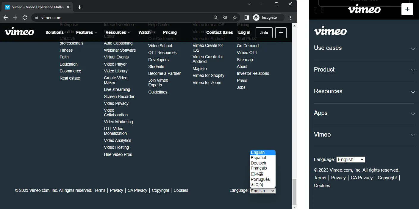
Vimeo
Vimeo features a single language selector on its website, located in the footer for both desktop and mobile versions. The simple dropdown menu includes various languages in their native names for easy recognition. However, the language selector lacks an icon (e.g., 'globe'), which might make it harder for users to find if they accidentally open the site in an unfamiliar language.
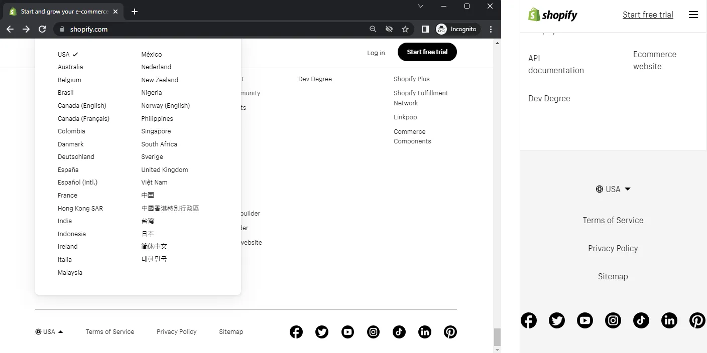
Shopify
Shopify's website features a single language selector in the footer for both desktop and mobile versions, marked by the easily identifiable 'globe' icon. Unlike other sites, Shopify primarily displays country names instead of language names. Some websites, particularly large companies and corporations, opt to use region or country selectors to present the appropriate website version to users. While less common, this approach is also considered acceptable in practice.
Language selector best practices
Language selector best practices are crucial to ensure an effective and accessible user experience. Here are some general design principles and recommendations for creating a user-friendly language selector:
-
Prioritize usability and accessibility: Make sure your language selector is easy to use and understand, accommodating users with varying levels of language proficiency and digital literacy.
-
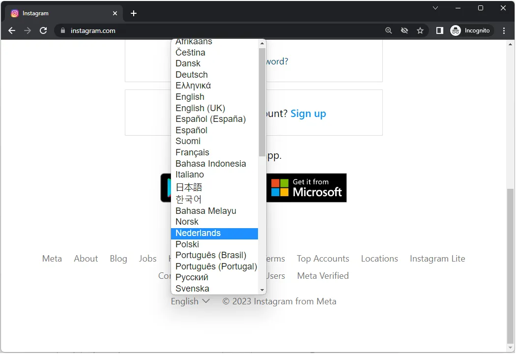
Use native language names and formats: List languages using their locale format and spelling, making it instantly recognizable to native speakers (e.g., use Deutsch instead of German).
-
Offer automation with customization: While automatically setting the language based on IP address or browser preferences is useful, always provide users the option to manually select their preferred language for a tailored experience.
-
Make the language selector easy to find: Place the language selector in noticeable areas such as the top menu or footer. Studies suggest top corners (left or right) for desktop applications and websites since users check the upper right and top left for language options. For mobile apps, position it above the fold or in the navigation menu.
-
Avoid using flags: As discussed earlier, flags can be controversial and misleading. Instead, opt for text, icons, or a combination of both to represent languages.
-
Use familiar visual representations: Use familiar visuals, such as a globe or map icon, with language names for an intuitive language selector. This helps when users encounter unknown languages or accidentally switch to one.
-
Grouping and sorting languages: For apps offering a large number of languages, group or sort languages logically or provide a search function with autocomplete to help users find their preferred language more easily.
-
Allow users to change language, country, and currency separately: International shoppers often expect to change site language, shipping country, and preferred currency independently. Also, they may prefer the original language for more detailed product information or additional listings. Others might seek a better exchange rate with a different currency, while some are simply curious about the company's global presence.
Conclusion
In summary, designing an effective language selector is crucial for improving user experience and catering to a diverse global audience. This blog post highlighted the importance of language selectors in apps and websites, discussed the controversy surrounding the use of country flags, and shared various design approaches and best practices. By examining popular websites' language selector implementations, we can learn valuable lessons to guide our own design choices. As you work on your apps and websites, prioritize creating a user-friendly and accessible language selector to enhance user engagement and ensure a seamless experience for all your users, regardless of their language preferences.
Like this article? Share it!
Zoran is a Software Engineer at Localizely. His primary interest is web development, but he also has a solid background in other technologies. For the last few years, he has been involved in the development of software localization tools.
Enjoying the read?
Subscribe to the Localizely blog newsletter for quality product content in your inbox.

Resources
- What is Localizely?
- Getting started
- Localization workflow
- Translation editor
- Flutter Over-the-Air updates
- Flutter In-Context Editing
- Project branching
- Public projects
- Professional translation services
- Machine Translation
- AI Translation
- Translation Memory
- Glossary
- Tasks
- Reports and statistics
- Figma integration
- AWS S3 integration
- GitHub integration
- GitLab integration
- Bitbucket integration
- CLI
- Configuration file
- Supported file formats
- Language & Country Codes
- Referral Program
- Affiliate Program
- I18N Questions
- FAQ
Free tools
- ICU message for translators
- ICU message editor
- Hreflang generator
- Hreflang checker
- JSON Flattener
- JSON Validator
- YAML Validator
- XML Validator
- CSV Validator
- Text Compare
- Text Encoding Converter
- Localization File Converter
- JSON Word Counter
- ARB Word Counter
- Translation Cost Calculator